Lilian Männikust's proposal for PERH for the Master's studio Healthy space
The effects of space on human health have been known since the 1980s, when the first scientific study proved that patients in a ward with a window recover better from surgery than in a ward without a window (E.M. Sternberg, 2010).
However, the guiding principle in the architecture of hospitals and clinics does not tend to be “whole space”, but to accommodate as many beds and services as possible. At the invitation of PERH (North Estonia Health Centre), under the scrutiny of the day surgery and day care department of a large hospital, the 1st year master’s students of interior architecture and product design at EKA looked for ways to make the hospital environment under pressure of strict requirements and efficiency human-friendly. The students analysed how the available space psychologically affects the user, how the materials affect the spatial experience and how to change people’s behaviour patterns in the space. One of the inputs of the work was the service design studio of the previous semester, which dealt with the improvement of the patient’s journey in day surgery, as well as the mapping of the patient’s journey in Riigi Innoteam and PERH. The master’s studio took place in close cooperation with PERH as a client.
Supervisors: Tüüne-Kristin Vaikla, Alina Nurmist, Maarja Mõtus, Silver Sternfeldt, Kärt Ojavee
Lilian Männikust – Võnge
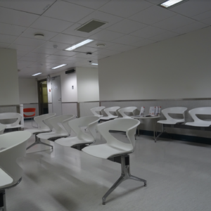
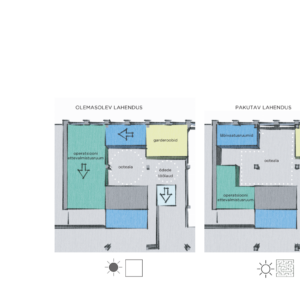
Surveys and interviews conducted in the hospital within the studio revealed that the waiting area of the day surgery department is conducive to stress. People are tense, nervous, and the environment exacerbates pre-operative stress, not a solution. The space solution of the waiting area is not patient-friendly and does not offer privacy or comfort. The existing solution does not let the natural daylight into the room and therefore has an artificial and intensive effect.
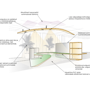
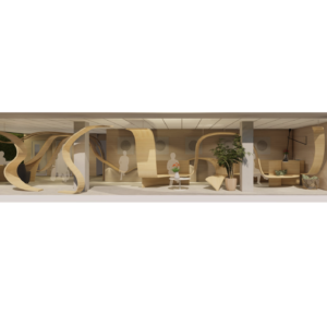
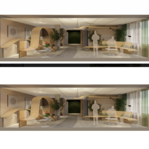
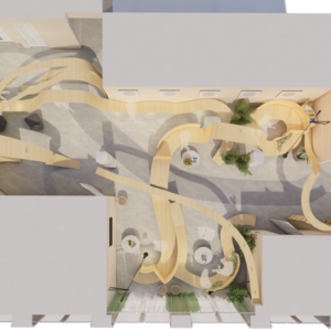
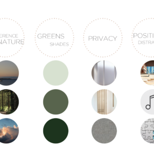
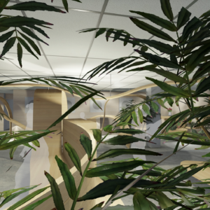
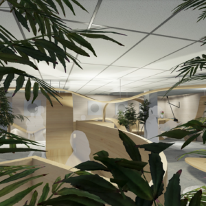
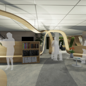
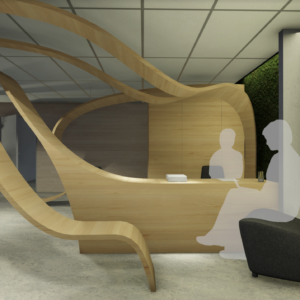
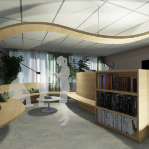
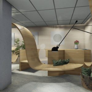
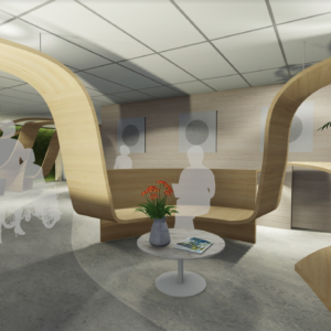
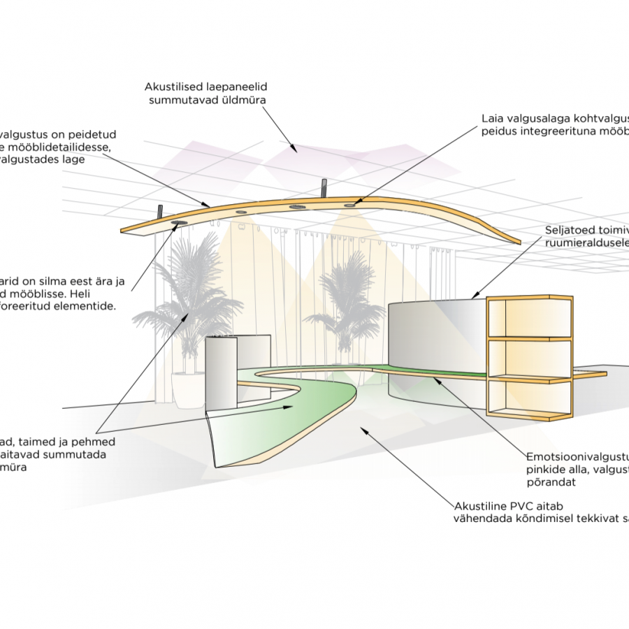
“Võnge” focuses on the waiting area of the department. The created solution provides daylight in the waiting room and offers rooms with different levels of privacy, where people who prefer both a private and an open area can find a suitable waiting place – while always being visible and accessible to the nurse. In contrast to the existing all-white, technically bright and rigid space, the design is playful, warm but at the same time bright, functional and user-friendly. The flowing form creates surfaces for benches, shelves, luminaires as well as a table surface. To avoid confusing the user, the main routes are marked by floor graphics.

